How to stand out in a corporate world? It's the type, stupid.
TBM Founder Chris Page and Head of Integrated Production Ross Frame delve into the common pitfalls of licensing fonts, which global brands are using custom versions, and what to consider when thinking about yours.


Late-stage capitalism is a torrid place, especially at a time when consumer budgets are shrinking under the pressures of an all-pervading cost of living crisis, every pound spent now must work harder.
It's at times like these that brands look for reassurance from two things:
1. Standing out: Quick recall and clear definition of their values and voice.
2. Gaining value from ownable brand assets.
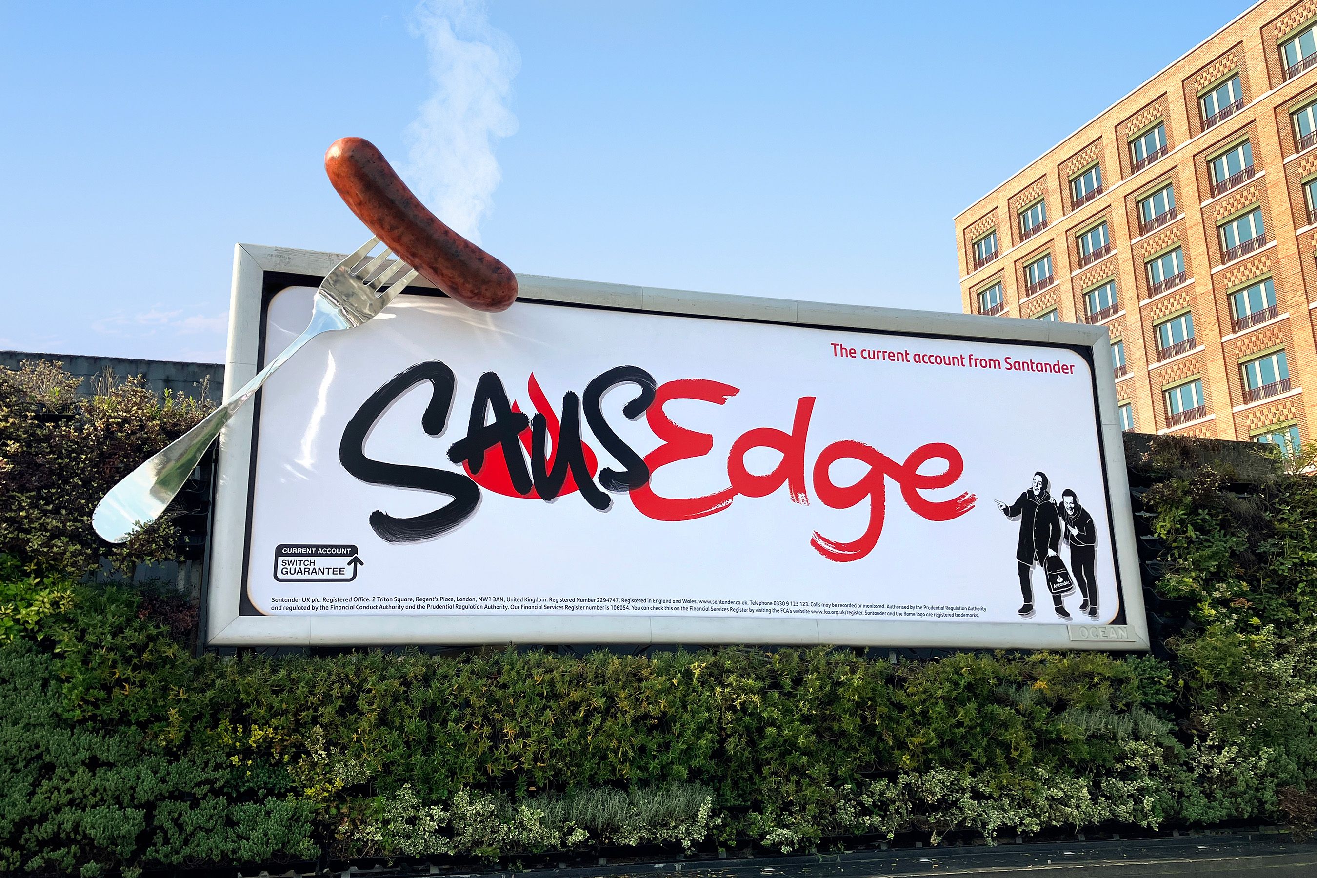
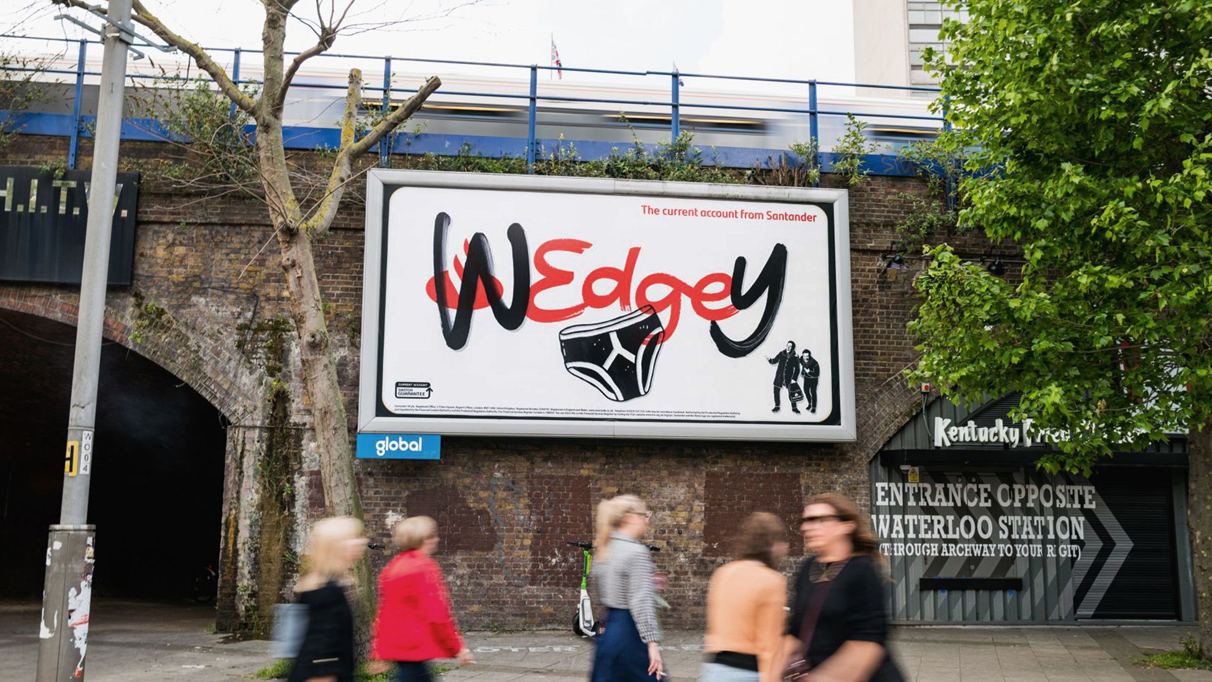
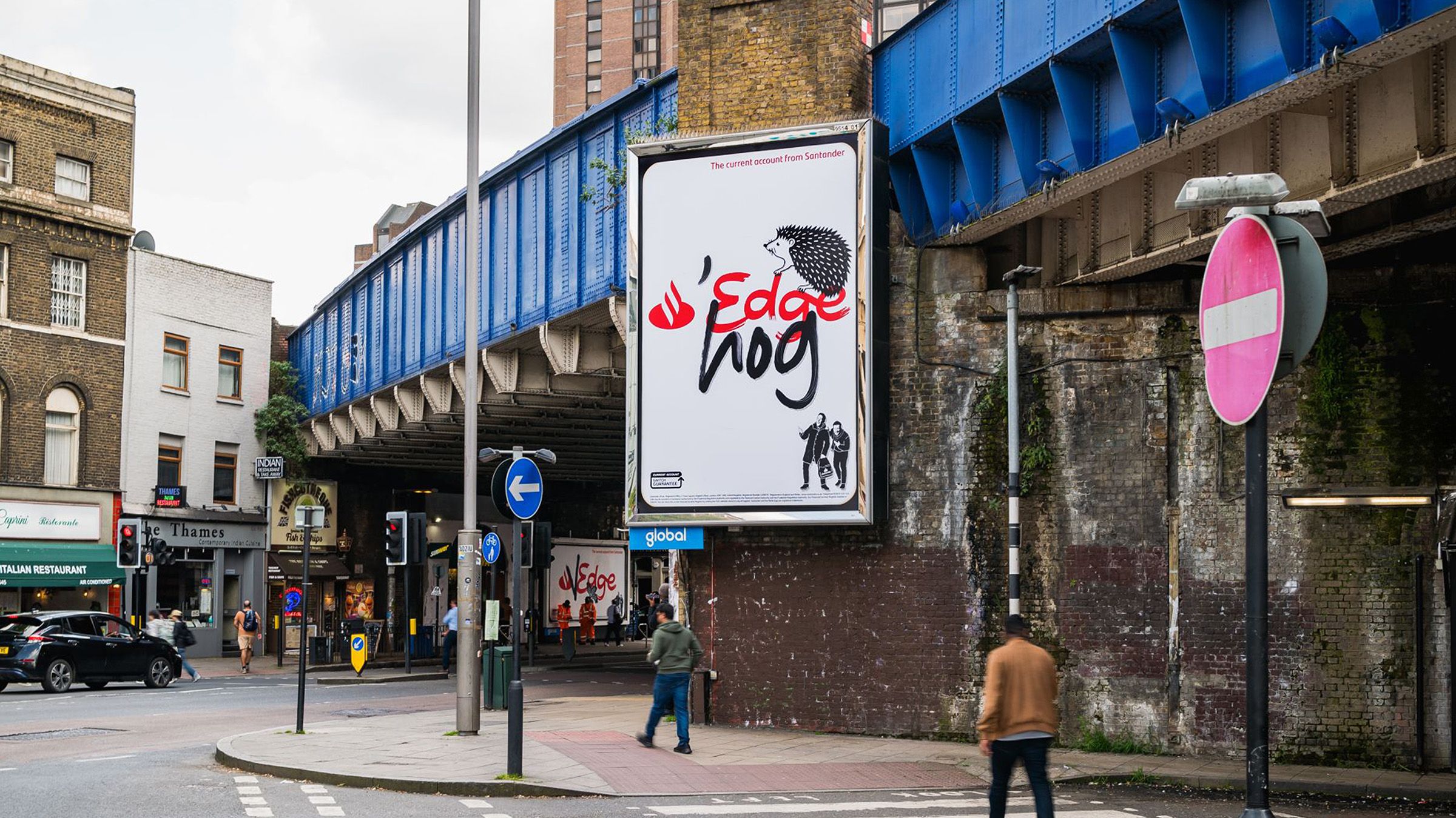
Here at Jelly, we have noticed that more brands are discovering and understanding the value of custom type, lettering, and fonts to help them to realise the worth of those two points. Case in point, Havas’s rebrand of ASDA launched recently, anchored by a brand new custom font.
Typography and lettering are always a consistent signpost to your written accent and tone of voice, whether that be the direct ‘loud shout’ of a single above-the-line campaign, or the steady, reassuring hum of your overall brand comms.
There are, of course, thousands of off-the-shelf solutions available, from generic san-serif corporate fonts to machine-tooled fake hand-lettering, all available from the big font licencing companies. But as anyone who has licenced a font for corporate or marketing use will tell you, it is not cheap, and it is normally a recurring cost. Licences need renewing, and as a business expands, so the licence costs can increase. And in the end, you are not purchasing anything ownable, you are leasing something that is designed and owned by someone else- and who knows who else is also using it.Cut-through and consistency of tone of voice are more important than ever in such a crowded market, which is whycreating a bespoke font is what most of the most successful global brands have done in recent times - from Netflix,Disney and Apple, to Google, YouTube and Duolingo, who say: “We're a language company, so the words we write and the typefaces we use go a long way toward expressing our brand”.
More clients then now prefer the single investment of creating a bespoke font that they can create and shape in ways that directly reflects their unique personality and messaging. Making an asset that is refined by the actual stakeholders within the business, using experts to help and shape the deliverables, using good advice along the way to end up with something that can then be shared among the relevant employees that consistently delivers across all materials.
For the newly initiated, the production process for a font or custom type may seem onerous and technical, but with expert help, it can become simple, here are some watchpoints from us:
Where and how your font will be used?
Every type project starts with this question. A font primarily used for headlines may be very different to a font used for longer pieces of copy. The former may need to be punchier and work over or alongside imagery, mainly in shorter sentences. Whereas the latter may be more paired back, focussing more on legibility to work equally well on a website or even as a PowerPoint document. By identifying this at the start means we can tailor our process to focus on creating the lettering to suit its final outcome.It may be that multiple fonts are needed to work together, like in the case of Oatly, who use three key bespoke fonts, supplemented with bespoke lettering where needed. Their fonts are all different, but all retain a hand rendered, DIY feel, ensuring whether you are looking at their product on a shelf or poster, a consistent tone of voice carries through across every touchpoint.
^ Above: Typeface for Oatly designed by Lars Elfman. Image from AdWeek
Should it look like a font?
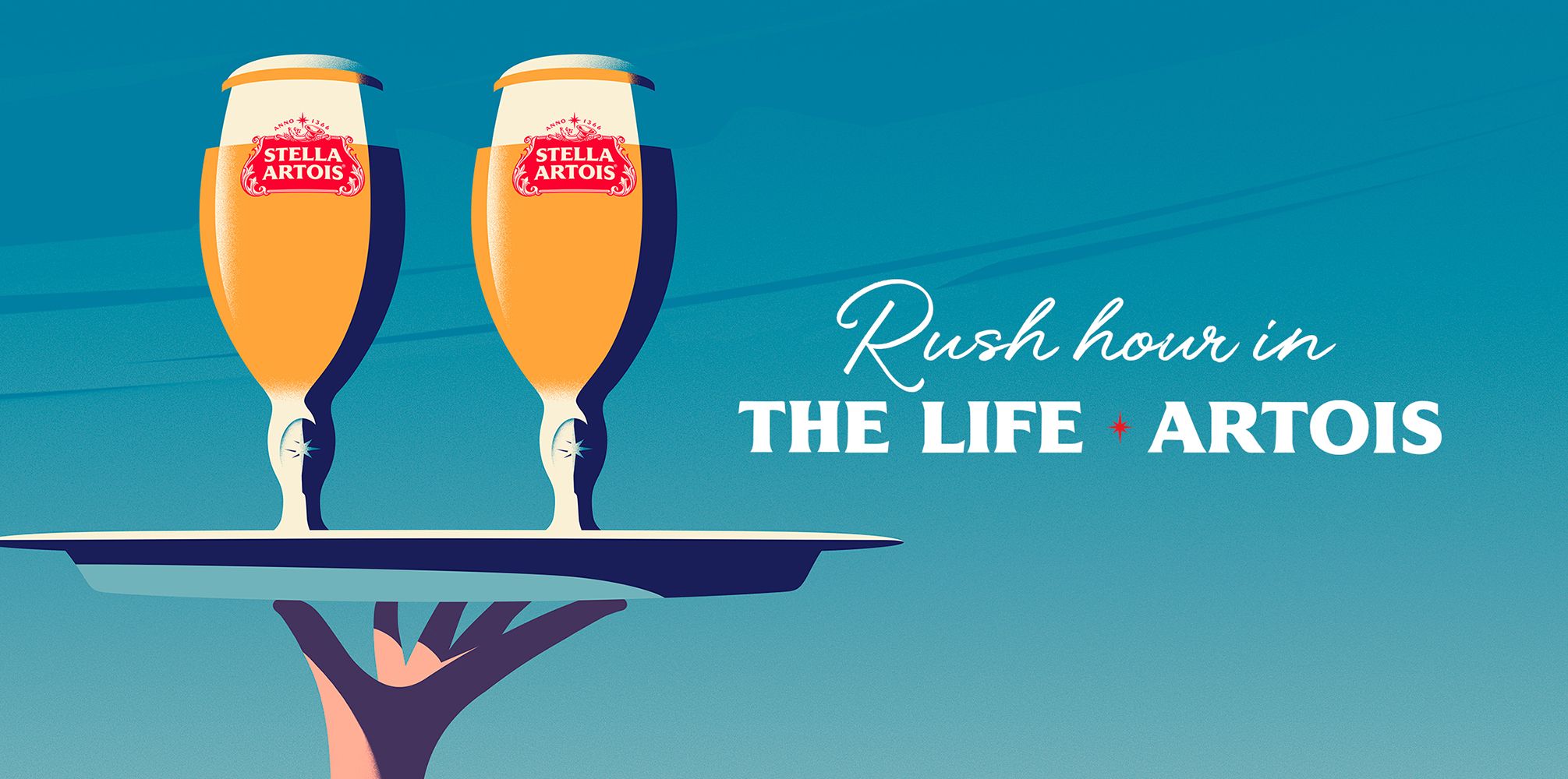
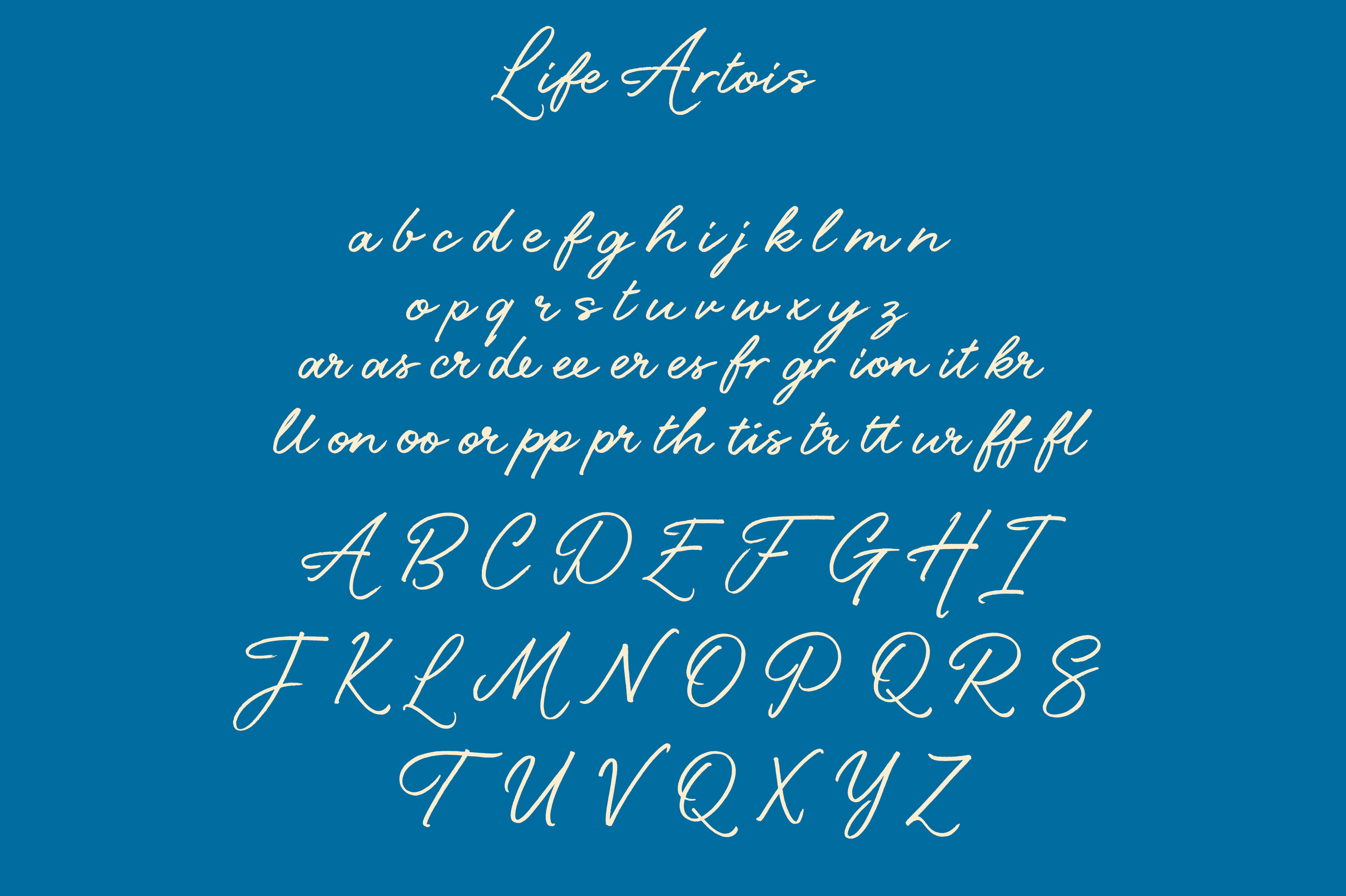
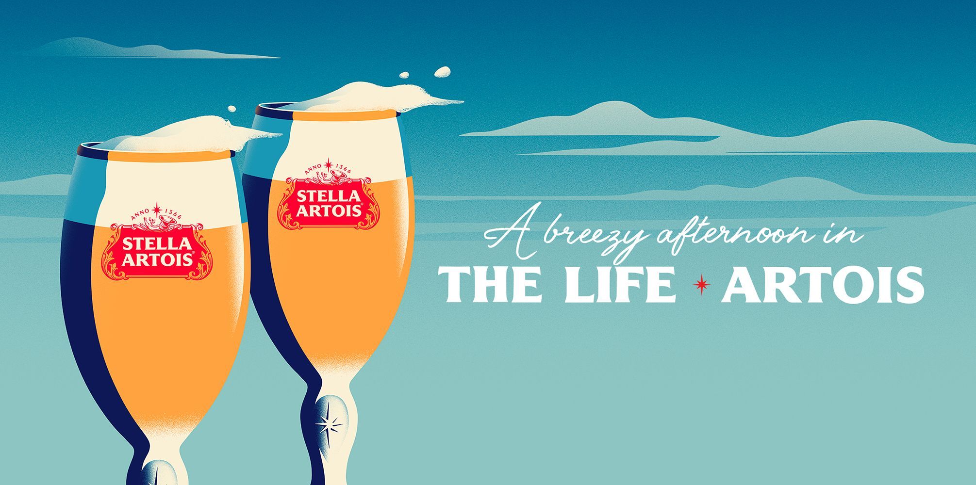
If you are looking to create a handwritten font, you may not actually want it to look like someone has typed it out. That is where character alternatives and ligatures (how two common letters join eg: double t -tt) come into play. The more of these alternatives you have within your font the more “real” it will look when it is typed out. A handwritten font allows you to transmit a certain feeling when it is being read, depending on how the type is created. Take ‘The Life Artois’ font created by Jelly’s Alison Carmichael for Stella Artois and programmed by Type Foundry F37. The font was designed with a fluidity and calmness to the characters to give off a sense of warmth and approachability, which echoed the sentiment of the visuals.
Slight changes to the handwriting style can have a noticeable effect, be that very quick and casual, as if it has been scribbled on a page, or more formal and considered, as if time and care has been taken over each word. There is also the opportunity to mimic the handwriting of someone close to the brand to give off a real sense of authenticity, as if the type has been written by that actual person.
How bespoke to do you want to go?
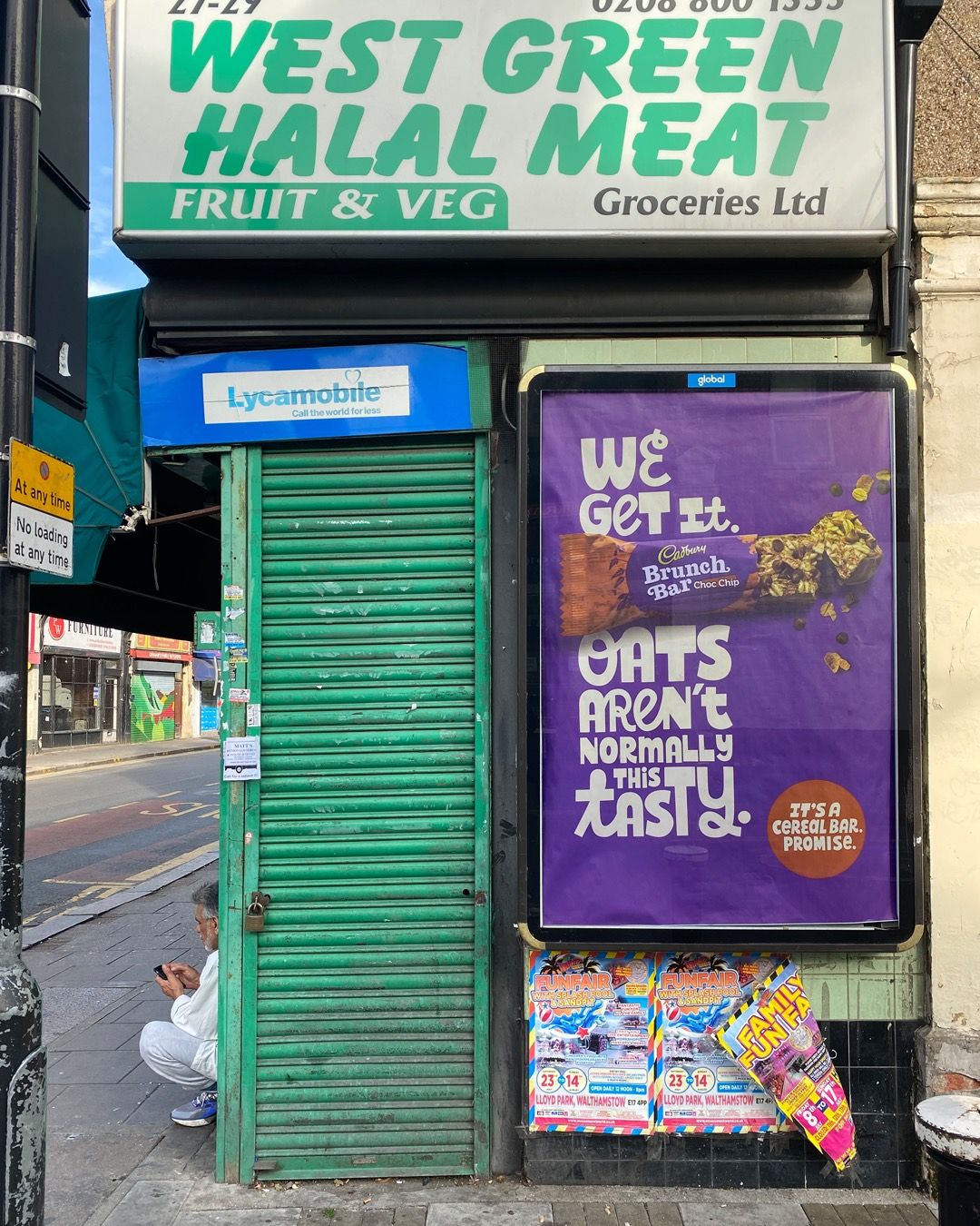
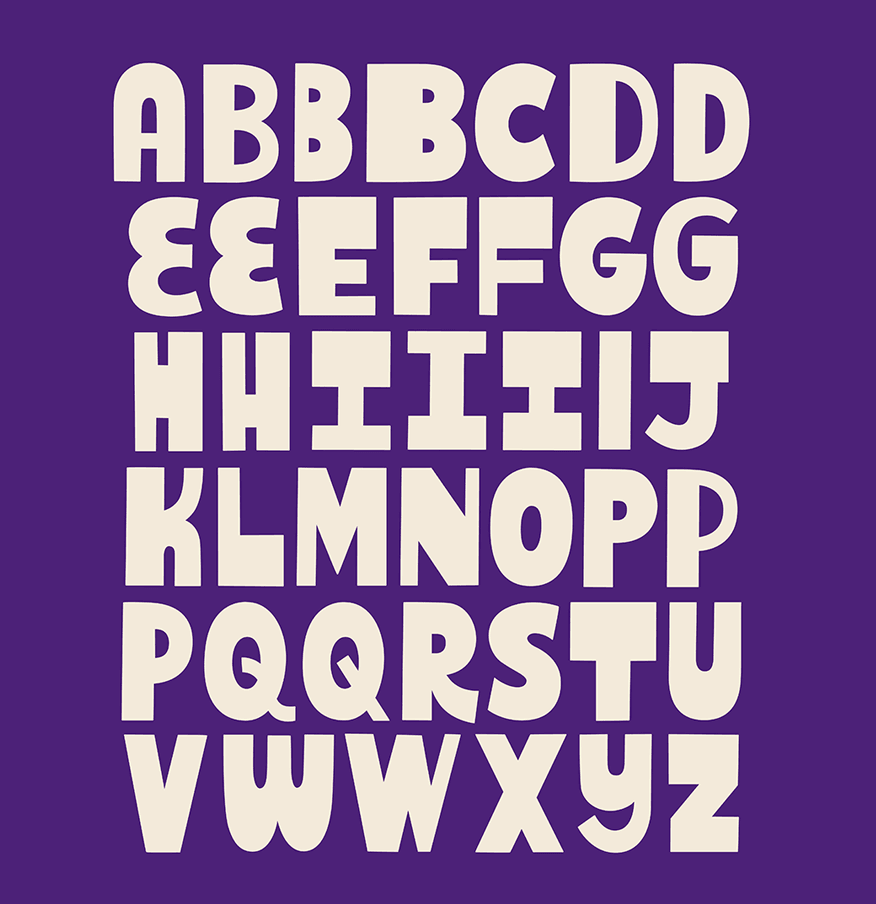
The real beauty in commissioning a font is that it really is yours. You have real control over every element and how much it is tailored to your brand. That does not just mean how the characters look but also how they act. For instance, if you want a more playful font, the letters could appear at random heights rather than sitting on a fixed baseline. Or 50 different versions of one character so you never see the same one twice. Justin Poulter’s font for Cadburys, produced by us at Jelly, uses a font system where two fonts are combined. Cadburys wanted the feeling of variety to come across to reflect the product being a mix of chocolate and oats, so we created a bold san-serif font, which could sit with a bespoke script font, giving the copy a feeling of being all mixed up.
These are just a few examples, but anything is doable within reason, because the font is being created from scratch to your specific needs.
Owning a font is not just about making something look how you want, it is also creating something that works for you. Creating one font that works across multiple languages means it can be rolled out across global markets with ease. And when copy needs changing at the last minute, which it inevitably will, that is all in your control. That is why, especially in today's market, it is a no brainer to spend time and money making one thing, with multiple uses over multiple areas with one use.
So, although type design and typography can feel like a highly specialised field to the uninitiated, it’s role and importance cannot be understated when it comes to transmitting values and tone of voice, either for a specific campaign or a brand transformation. By using proven, and experienced, craft and design partners, brands of all sizes can change the way that they are perceived by customers, and their values and character can be instantly transmitted and understood by the user or purchaser.
As we can see above, there are many ways of achieving this, but any message to the customer is essentially carried by the type and typography of the communication, and therefore the type should be yours and yours alone, which means that when all is said and done, it’s the type what does it. So don't be stupid, invest in it.


What We Do
We specialise in bold visual content and brand storytelling.