Type Tips: 10 Design Resources From Our Artists
Typography can be a mystifying medium and if you want to give type design a go, or just want to know more about it then you might well be stuck on where to start. Luckily our lettering artists have shared with us their favourite places to find inspiration that keep their creative juices flowing.
Biff
Characterful artist Biff crafts his lettering with a relaxed style, endless personality and a treasure-trove of pop-culture influences. He shared with us a couple of the resources he uses and why he searches for inspiration outside of the internet.
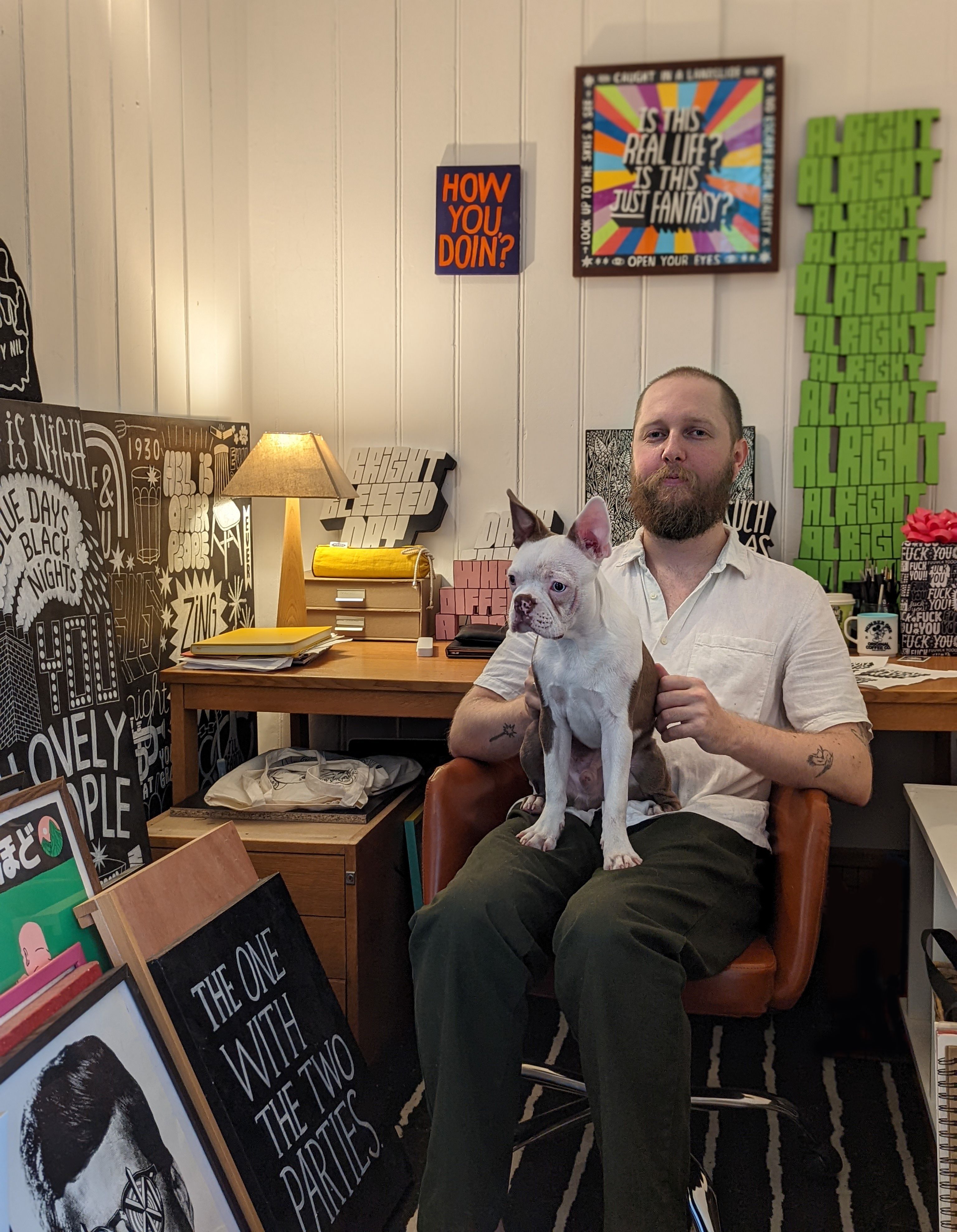

"Take something, make it your own and give yourself the confidence to say - this would look way more bad-ass if I drew it."
^Above image: Booksaboutart.co.uk
Books About Art
Buy more books! Don't rely on the internet. Books are typically a lot more informative as the artists have compiled and composed the whole thing. They're able to articulate their processes in depth and I think it can give you more clarity. In turn, boosting your confidence when you can somewhat relate and realise we're all in the same boat. Looking at work is one thing, understanding why they're doing it can sometimes be as, if not more beneficial. Also seeing the work in print has a slightly different impact- it's more immediate and tangible. Also, if you have access to a local library or bookshop that has an art section, browsing and picking a book in person can help decide what you buy as you might stumble across a gem you wouldn't normally find online. Knowledge is power!
Take a Look Around
It sounds obvious, if not a little bit cliche, but I think the power of observation and perception is underrated. Training your brain to be more observant of your surroundings can be your most valuable tool. And it's free! Personally, I rarely look at artists/ lettering artists who make similar work to my own. It can sometimes hinder or over-influence what I make and dictate how I think. Look more at everyday objects like crisp packets, lettering used in film or bigger things like how a restaurant's been branded. Then think, how would I interpret this if someone came to me with this as a brief? When you really look, there's an endless array of things to make better (or ruin, but don't be afraid). Take something and make it your own and give yourself the confidence to say, this would look way more bad-ass if I drew it. In my experience clients/ people in general find hand lettering more endearing and relatable. That's where the value lies. Observation + personality = great work.
See Biff's full lettering portfolio here.


Lebassis
With super bold lettering that bursts off the screen, Lebassis crafts his designs to be larger than life and bring joy and colour to any brief. He explores with us his love for looking to the past for inspiration.


"I'm passionate about exploring old and archival typography."
^Above image: Fonts In Use, Maven Creative
Fonts In Use
Fonts In Use holds a special place in my heart. It keeps me updated on the latest type releases and showcases how people are using them. It's like a typography newspaper for me! Additionally, its extensive archive of old types is a valuable resource that enriches my exploration of typography.
Flickr
I can spend hours delving into its collection of old photo letterings. I follow numerous users with amazing collections and It's my go-to for finding inspiration for new typefaces and lettering projects, and color palettes!
See Lebassis's full illustration & lettering portfolio here.

Daniël Maarleveld
Innovative designer Daniël uses his love for hacking systems and programs to create digital lettering and continuously experiment with new and unexpected tools. Here he shares his top picks that help craft his designs.


"I get most of my inspiration from endless sketching and experimenting, but sometimes it's also good to look at fonts from different perspectives for new ideas on how to use them."
^Above: Future Fonts, Nostra.
Font Gauntlet
I use the site to test variable fonts made by Dynamo, even when I'm building them. It has good default options for testing animations, which greatly helps me in font development.
Future Fonts
Future fonts is a Kickstarter site for fonts where you can buy fonts in development for a low price, but you get endless updates with each update making the font slightly more expensive. I also have two fonts listed here that I made with Edgar Walthert. (Purple Haze, Electric Blue)
Check out Daniël's portfolio here.
Justin Poulter
Textural lettering artist Justin designs his illustrations with a strong brand view and considered juxtaposition of clean lines with gritty effects. He shares with us why he finds his biggest inspiration when looking in unexpected corners of the world.


"I think for most people, inspiration hits when you're not expecting it and this is why stumbling across these signs is a constant inspiration for me"
Observational Inspiration
I find most of my typographic inspiration from signage out and about on the streets. I especially like signage that's made cheaply or in a DIY way. The typography on these signs often has an unintentionally unique quality, things like unequal widths, a combination of clashing styles or an uneven edge. This is what inspires me when designing my own lettering.
I use photos I've taken of these kinds of signs over the years as reference when I'm sketching out ideas at the beginning of my process.
Skate Into Inspiration
Another constant and almost lifelong inspiration for me has been skateboard graphics. Going into a skateshop and seeing all the board art, t-shirt graphics, paging through the magazines and watching the videos was one of my first resonant experiences of illustration and continues to be.
See more of Justin's lettering & illustration work here.

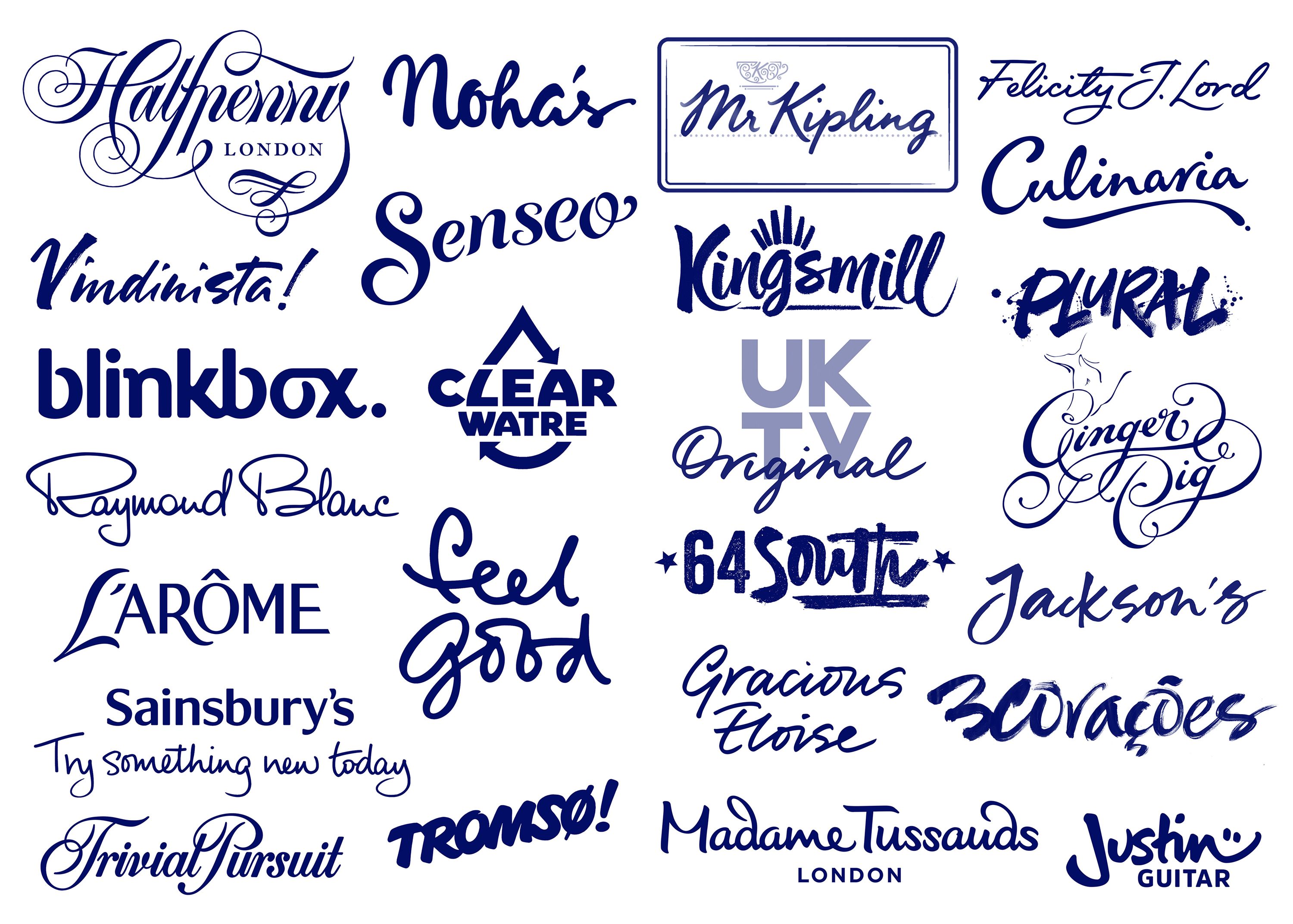
Alison Carmichael
As a lettering artist with a strong sense of hand-crafted authenticity Alison has created designs and logos for some of the world's most recognisable brands. Here she explains her love for handwriting and the book she recommends every type enthusiast own.
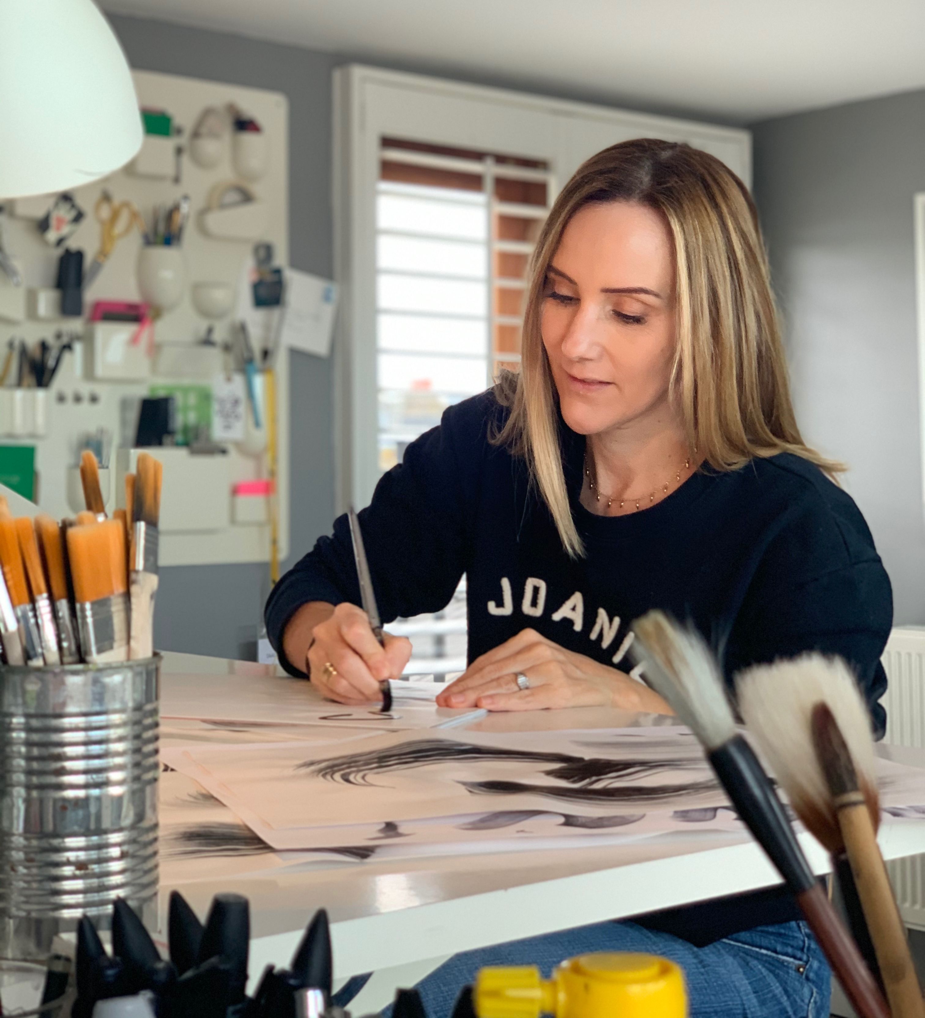

"Try to be inspired by unexpected references and mediums and don’t just copy stuff that you may have seen on Instagram, otherwise you run the risk of making yourself invisible amongst a global sea of other lettering artists!"
^Above: House Industries Lettering Manual, Typism.
House Industries Lettering Manual by Ken Barber.
As well as showcasing their beautiful lettering and design work, the book has insights on letterform creation, how to use references and Ken shares his own sketches showing early concepts and lots of tips on how to create beautiful lettering designs.
A Personal Touch
Collecting handwriting samples is my way of having a wide range of alternative references so that I can offer different ways of presenting ‘voices’ and handwriting styles.
Everybody writes differently depending on age, mood, ethnicity, pace and it always communicates something subconscious about the writer. I find it really helpful to borrow nuances from different people’s handwriting to help tell a story or evoke an emotion in my commercial work.
Take a look at Alison's lettering portfolio here.
What We Do
We specialise in bold visual content and brand storytelling.