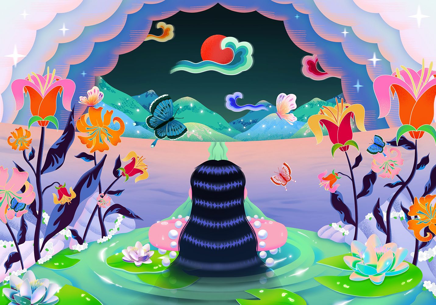
Working directly with a long-time collaborator of ours, Kiehl’s, Futures artist Jordan crafted a library of assets for the ‘Kiehl’s Loves’ campaign which celebrates the brand’s presence in cities worldwide. Continuing the annual tradition of partnering with an acclaimed artist for this collection, Jordan brought her considered composition skills to the brief, creating designs to be used across print, digital marketing and limited-edition packaging.
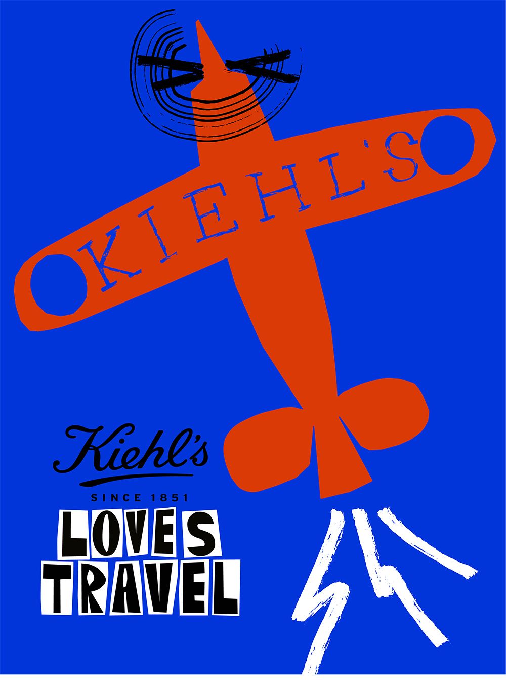
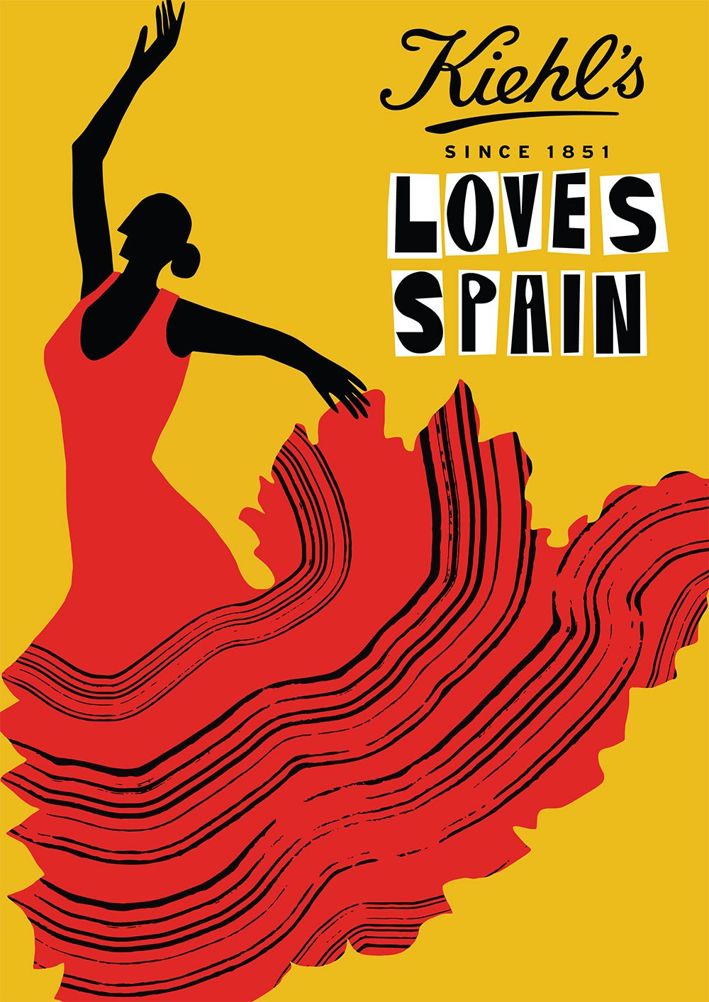
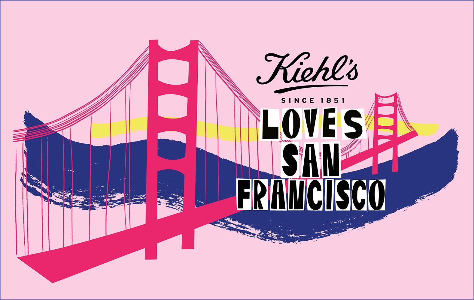
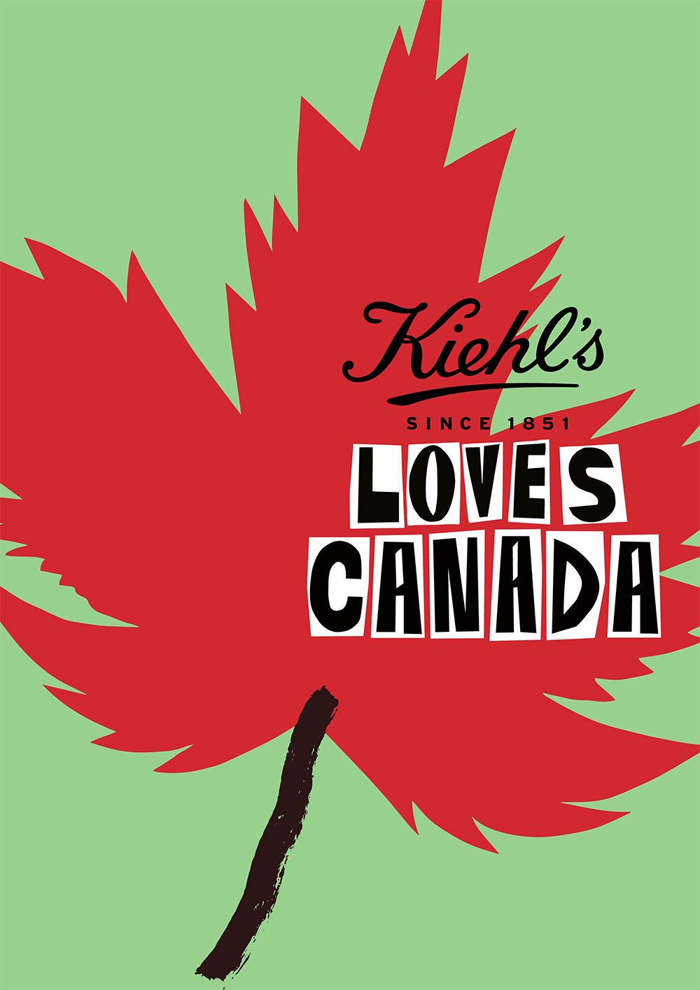
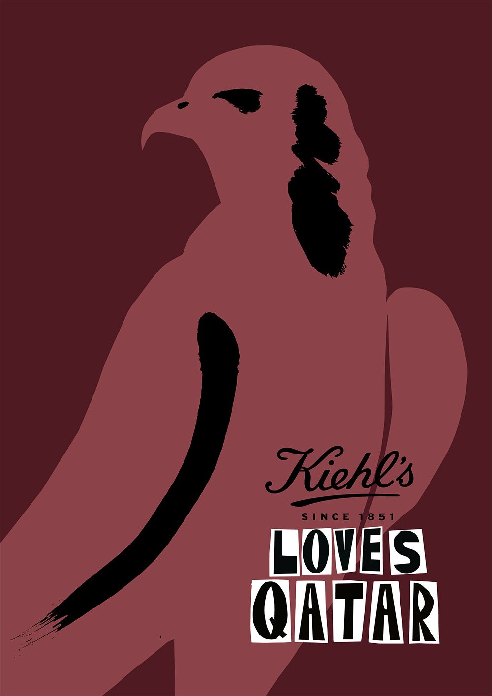
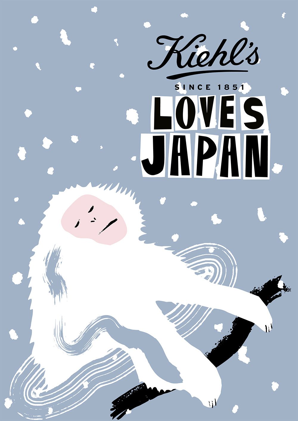
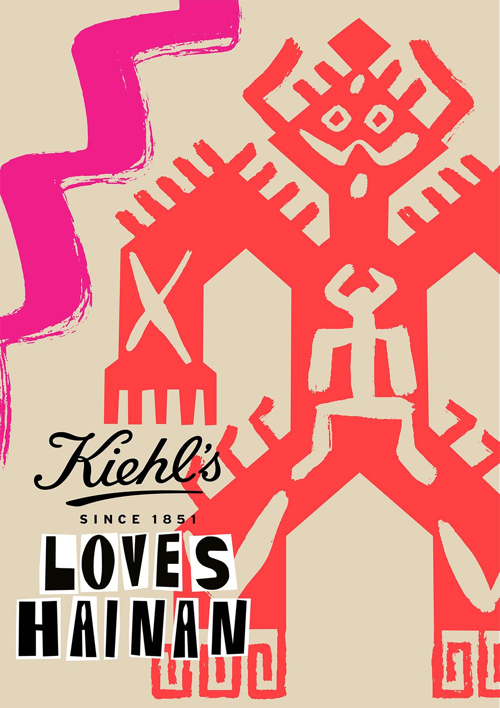
As the campaign celebrates the cities that Kiehl’s ‘loves’, Jordan was tasked with creating illustrations for all twenty markets, bringing together visual motifs, typography and iconic landmarks unique to each cities culture and history, alongside imagery from Kiehl’s rich brand heritage such as the famous Mr Bones skeleton.
Jordan’s designs combine her use of bold shapes and colours, with iconography that pays homage to each market, balancing illustration with typography to make versatile designs that have many applications across the campaign.
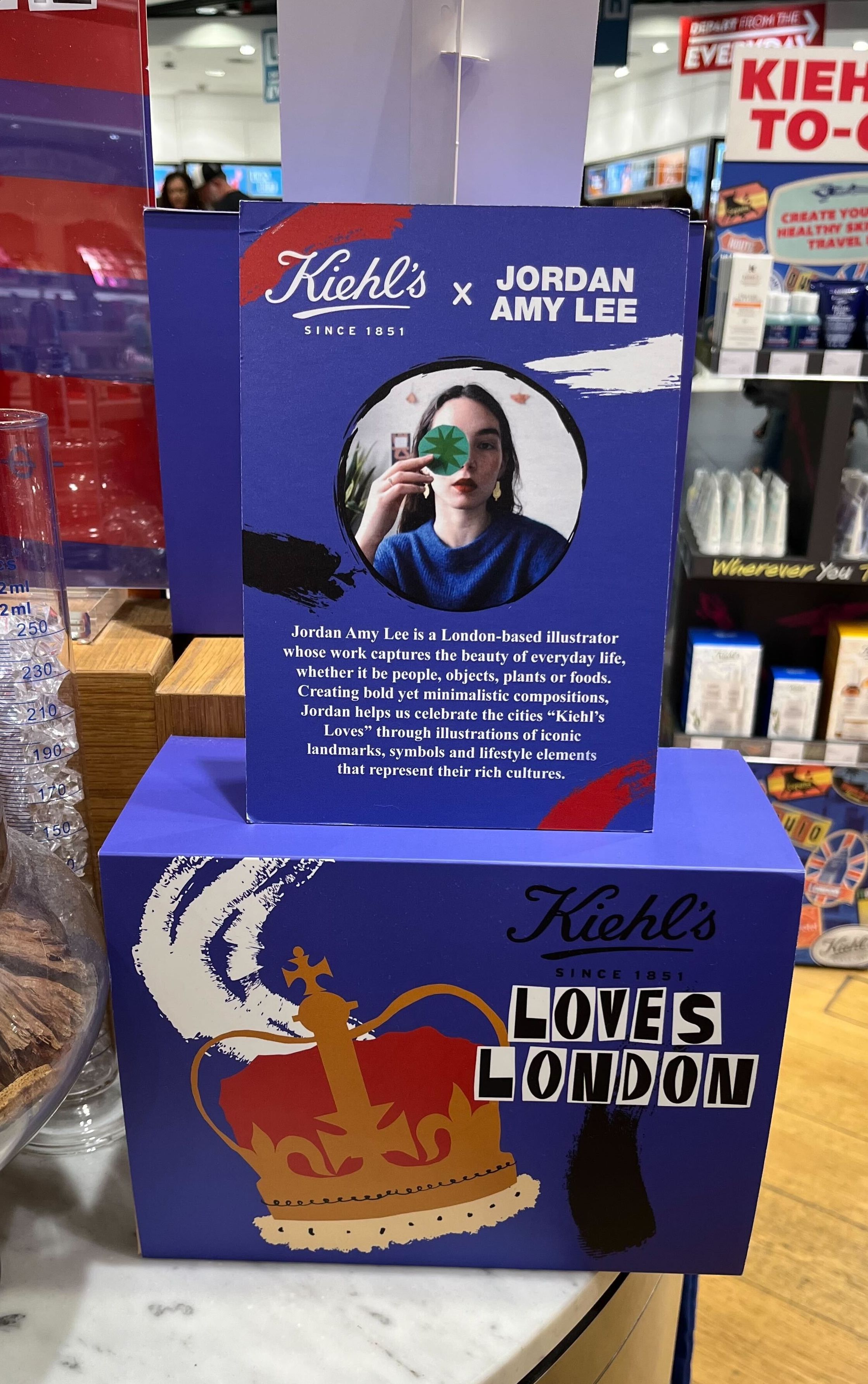
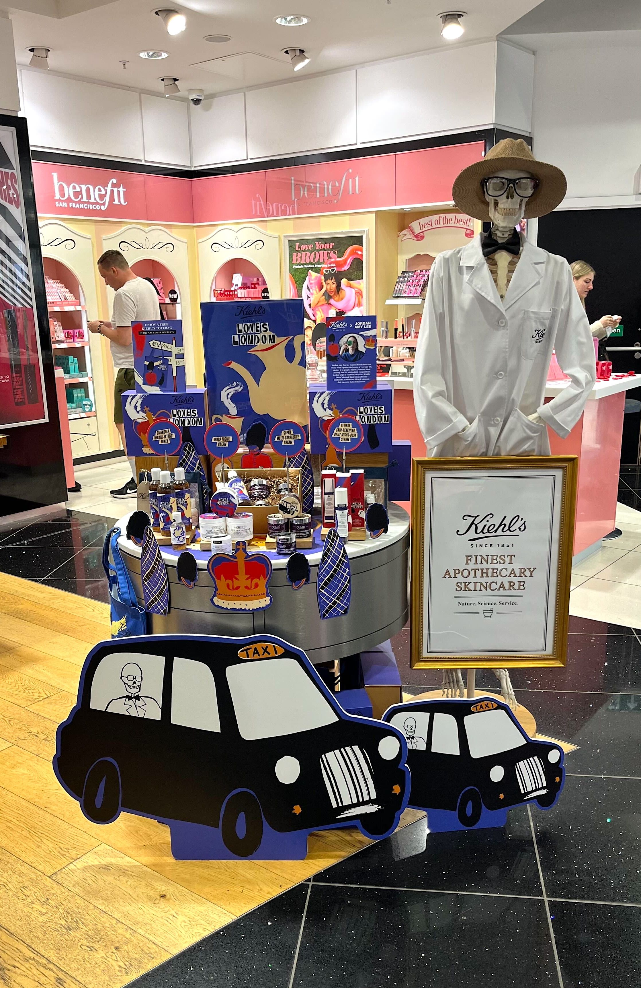
"Kiehl's LOVES is a campaign that boldly celebrates our global community in a personalized manner. This year, in collaboration with Jelly and the esteemed artist Jordan Amy Lee, we successfully launched this extensive campaign across our worldwide retail and travel locations. The scope of deliverables was vast and meticulously tailored to each market. The Jelly team facilitated an exceptionally smooth process, managing numerous moving parts with streamlined communication, unwavering adherence to timelines, and pivotal milestones. Jordan Amy Lee's artistic interpretation uniquely illuminated each market and zone, enriching our campaign with her distinctive aesthetic. We are thrilled with the final results achieved through our collaboration with both Jelly and Jordan Amy Lee. Jordan's elevated style, characterized by its play of scale, color dynamics, and thoughtful composition, has undeniably elevated the impact of Kiehl's LOVES, offering a delightful dopamine boost to all involved."
- Hussain Salahuddin, AVP of Global Brand Creative at Kiehl's - L'Oreal USA
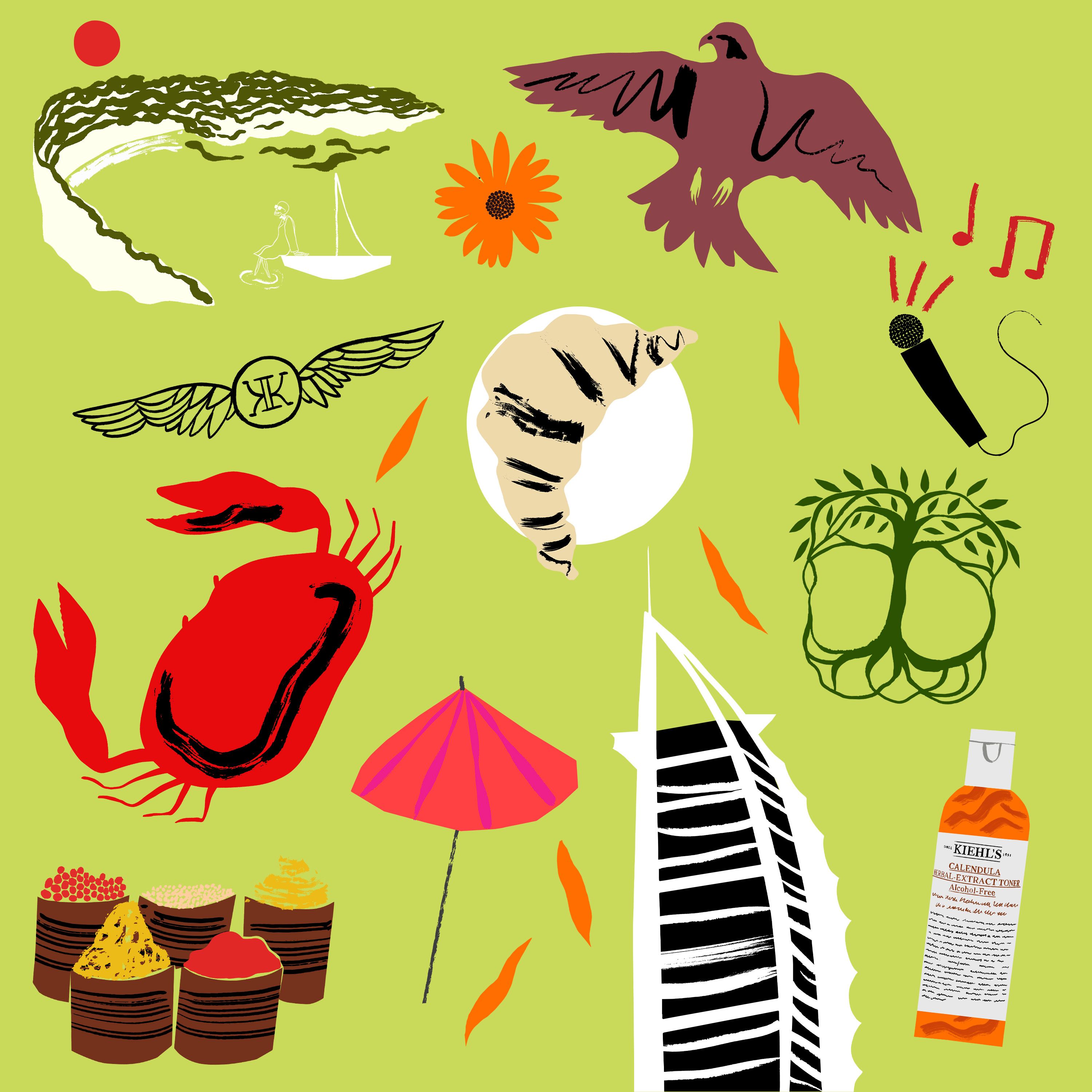

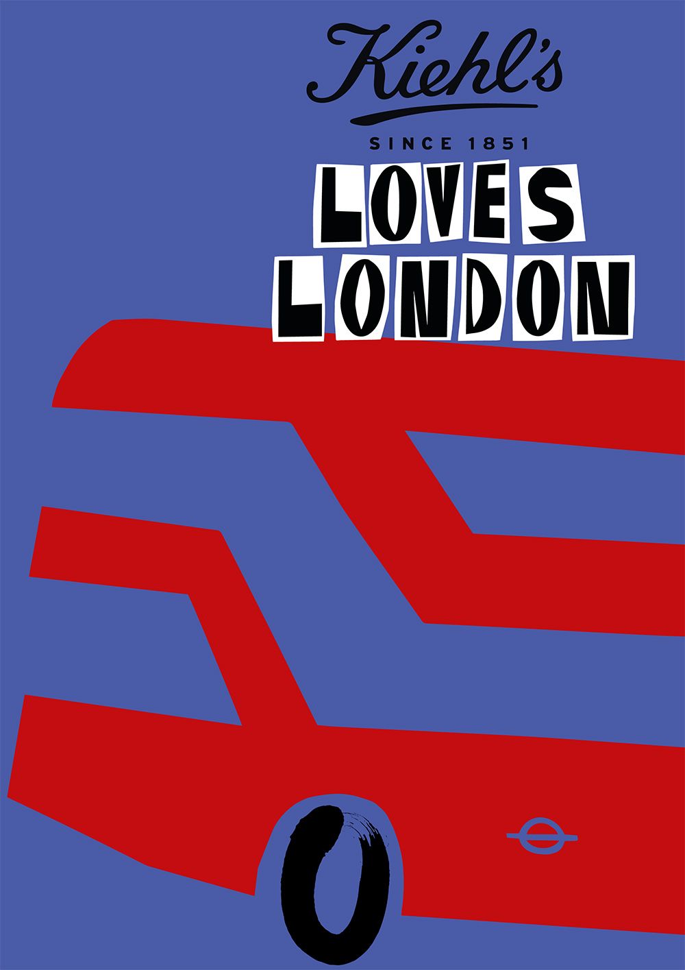
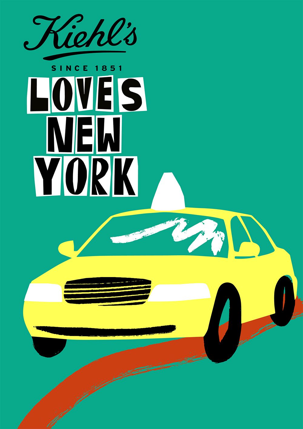
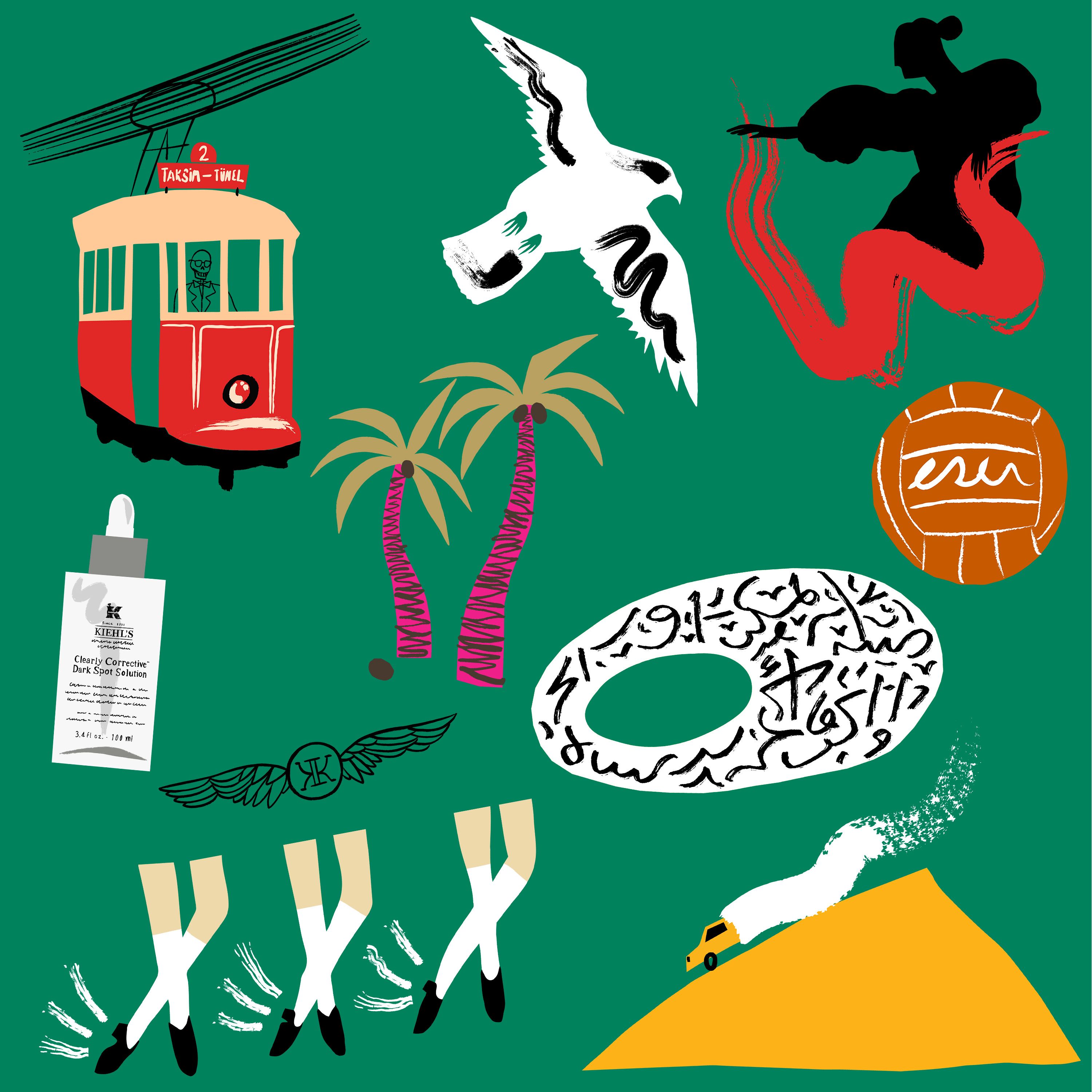
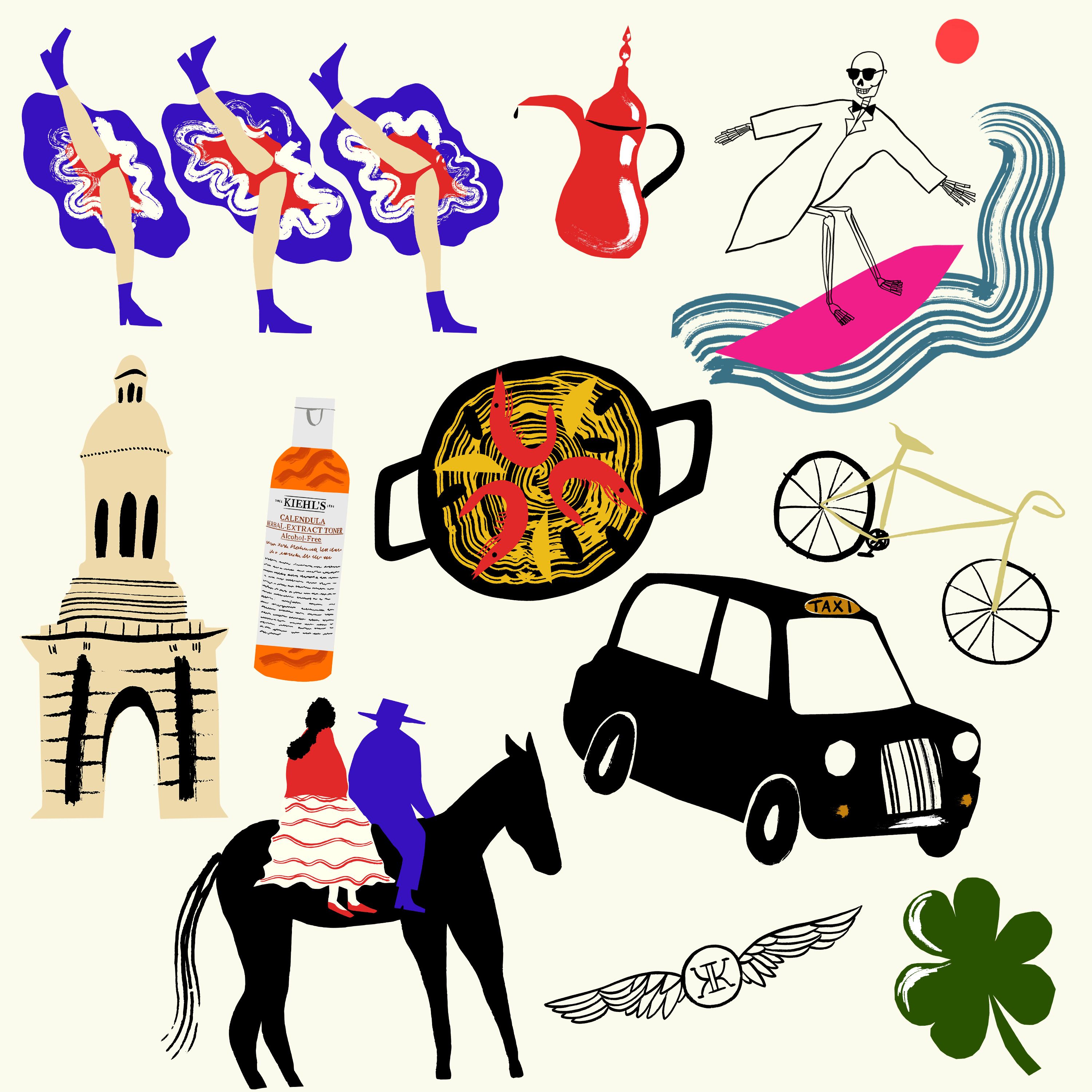
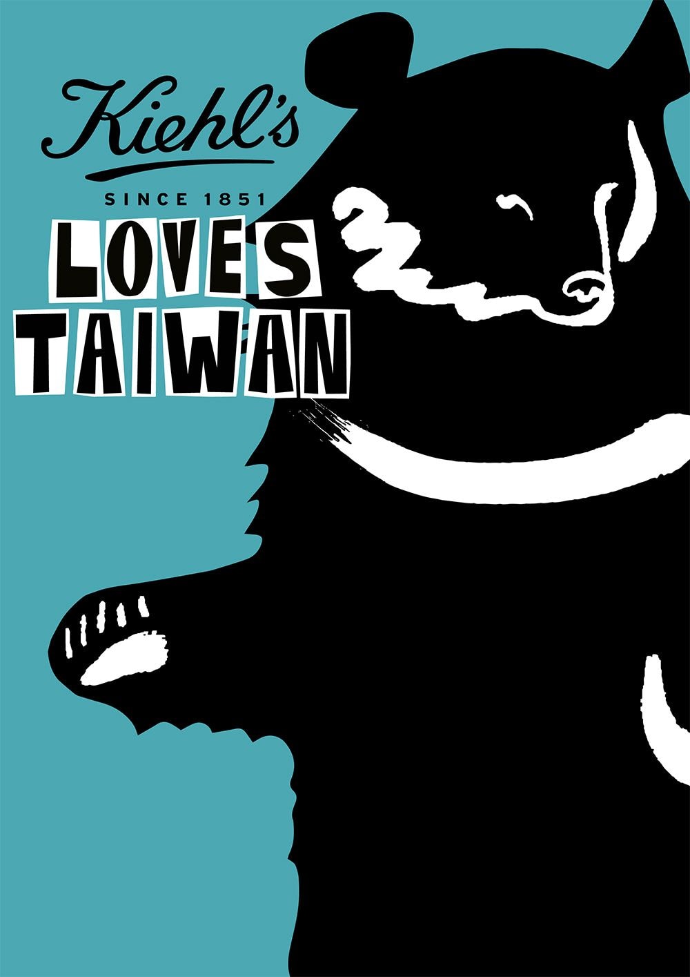
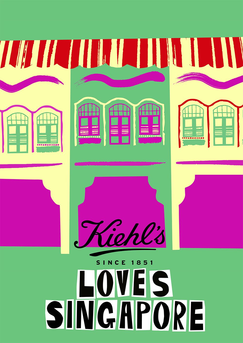
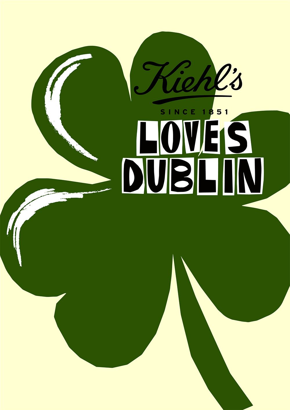
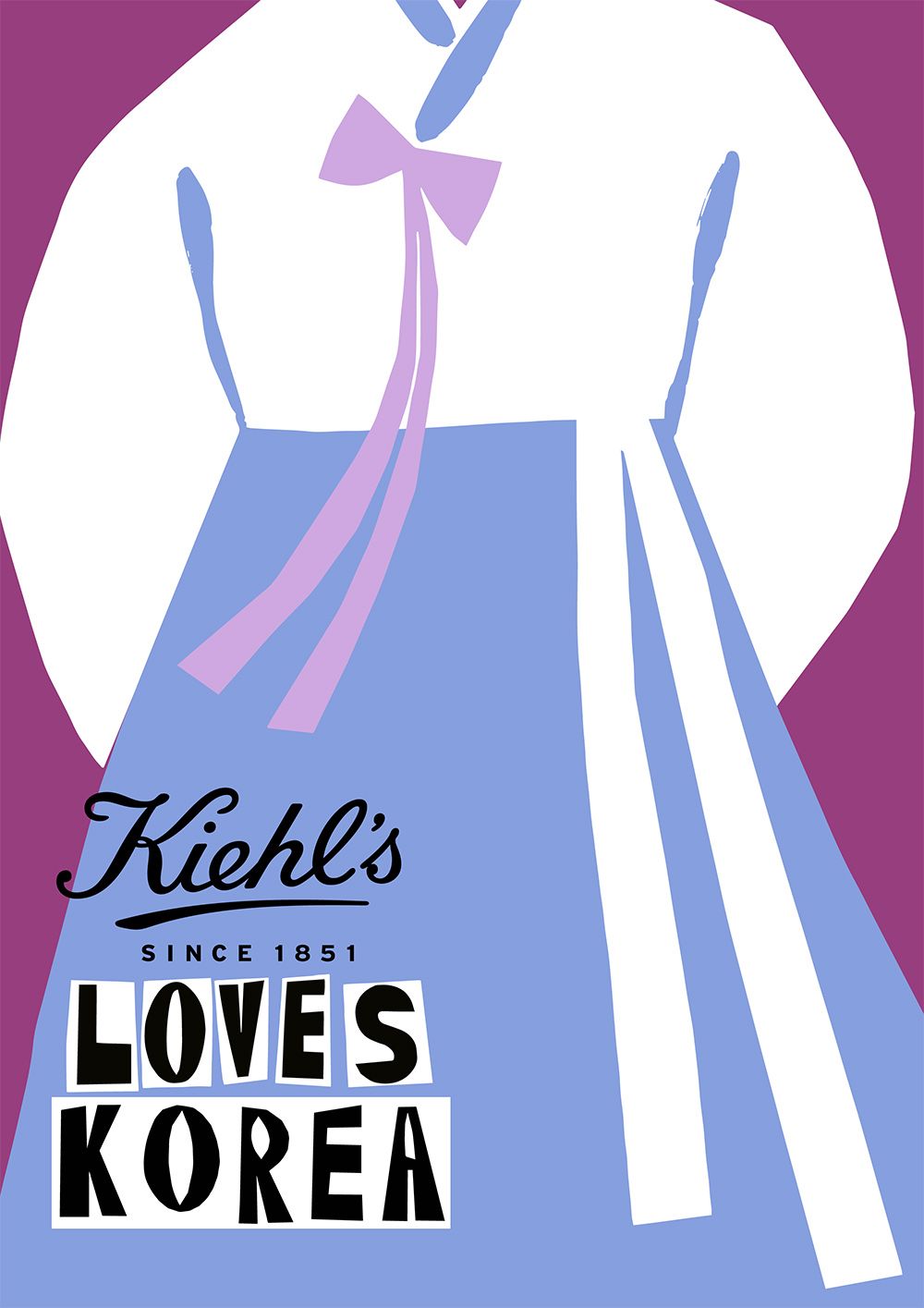
'The intention for this year’s campaign was for the illustrations to hint at a dynamic ‘punk’ style which I kept in mind when approaching the style and typography. So, that was very fun to do and pretty up my street. I wanted to illustrate all the elements in a striking and bold way, as there were only a limited amount per location so they really had to stand out. I kept things as simple as I could and stripped each element down to its basic shape, then used bold brushstrokes to add the detail and texture to contrast nicely with the flat block colour shapes. The crab illustration for Hainan is definitely a favourite - I created it during a test round before securing the project, and I think it really worked to inform the style for the rest of the project. I also really like the snow monkey I illustrated for Japan, just because it's cute!' - Jordan
How we helped


Meet the Futures
We support the next generation of creative talent through our Futures program
Explore the Roster